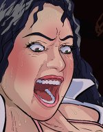
The first step in creating the illusion of sweat and tears in an illustration are understanding where on the body sweat and tears are most likely to occur. Generally, depending on the level of sweat, it starts in key places; the forehead; temples, nose bridge and cheeks. The underarms and décolletage. Sweat can represented as beads, beads with trails (which always move downward with gravity and follow the contour of the surface. Tears are the same and originate with the tear ducts on the inner corner of the eye but can spread to the outer corners and cheeks with eyelid batting and squeezing.
Both sweat and tears are more easily illustrated in a color drawing, as they can be painted in translucent layers of white; the trails more transparent than the bead, and the bead more transparent than the stark highlight on the bead. For a very sweaty body, there are large patches of translucent sheen sweat with spattered highlights over the areas mentioned in relation to the light source(s). In a nut shell, sweat, tears, and "wetness" are best represented in high contrast reflection set against flat tones. See example attached.
In strict B&W line drawing, the beads and trails can be represented by shadow lines opposite the light source, with the line darker under the bead, and the line lighter and trailing off with the sweat trail. This relies less on the realism of the light pay and more as a convincing leap-of-faith on the part of the viewer understanding that this is the logical location where sweat occurs.
Obviously the very sweaty body will have more pores opening in sequence, and as moisture builds, surface tension will coalesce into beads and eventually roll off - such as the inner thighs, back to butt-crack and so on.
It is also worth noting that in line drawings, sometimes LESS is MORE, as too many line indications of sweat and tears become heavy-handed noise and unconvincing. Sometimes, just a hint is enough -trust the viewer to put it all together.