• If you would like to get your account Verified, read this thread
  • The TMF is sponsored by Clips4sale - By supporting them, you're supporting us.
  • >>> If you cannot get into your account email me at [email protected] <<<
    Don't forget to include your username

Our Symbol

What Should Our Symbol Be?

  • Feather pendant (Invertable to discern your tickle preference)

    Votes: 31 73.8%
  • Temporary tattoos

    Votes: 0 0.0%
  • Question mark

    Votes: 1 2.4%
  • Other (post suggestion below)

    Votes: 10 23.8%

  • Total voters
    42
interesting...

i definitely think ness is on the right track here. just throwin my two cents in.
 
Thanks, guys...I forgot to mentoin when I posted the picture but the idea is of a feather just simplified...iconized...? Is that a word? My art history days are long passed and I dont remember the word I'm looking for.
 
its actually readily apparent thats what you were going for, at lest to me. i think the word you are looking for is abstraction. the image of a feather, abstracted. 🙂
 
Ness, great pictures! I'd wear that. See, when a few creative (and determined) people get together you see some great results.

Personally, I like all the designs brought forward. I especially like that we've pretty much decided on the circle idea, because that's (in my mind) the best design for some kind of pendant. In fact, now I wish I had one of these to wear around.

And thanks to AcornaMordor for starting the topic. This is the first topic I've ever replied to here. I'm mostly a lurker, but this topic has really made me think more about posting here.
 
i don't know about the rest of the community,but for me, thease are the symbols we should use! not only are they subtle enough to wear without going noticed by non ticklephiles, but the idea of different ones for different types of ticklers is awsome! especialy the "switch" symbol, brilyant!

perhaps we should post another poll to see if thease should be the "official" symbols for us all.

great work ness!!
 
What about the SMBD community? How do they incorporate orientation into their symbol?

And, does it really matter? Shouldn't tickling be give and take?

Maybe hinting one's preference is a bit too much, especially in the regards of "bottoms", whose orientation might be ground for exploitation.

Just my idea, but let's stick with the basis. 🙂

I am not commenting on Ness's pics here [hi there, Ness! 🙂 ] - but rather, I am reasoning on the whole idea.
And if I may repeat myself, I'd steer clear of celtic/runic symbols.

While my simbol is descriptive, it can be easily simplified. I feel abstract is good, but it shouldn't recall futhark, ogham or something like that too closely. 🙂

Most celtic/viking devices have been widely reproducted, and I'd rather go for something original.

This said, what will we do now? 🙂
 
I LOVE Nessy's proposal!!! It incorporates the "feather" theme, yet it's also simple and elegant. It would look good on guys as well as gals.

I want to buy a pair: a 'ler symbol for me (to forewarn the guys, LOL), and a 'lee symbol for my subby hubby 😉

Edit: I kind of agree with Kalamos' concern about the 'lee symbol possibly being misinterpreted. I'm not totally sure how one would work around that; for example, my sub-hub is 100% 'lee but he is selective about which mistress(es) he would want to serve. Still, he would not want to be mistaken for a 'ler, which could cause other kinds of misunderstanding. Interesting thought to ponder.
 
Last edited:
[Commenting on Val's post]

To people outside fetish/SM community, being a bottom probably equals to being "weak" or submissive [in a broad sense] - which is far from true.

But, hey, we are still in the thinking up phase, so, post your ideas. 🙂

Besides, preference is optional - none is forced to divulge it - or to wear a symbol at all. 🙂


Reg's.
 
Very very good points, K.
I think it would work equally well using just the 'ler (pointing up) symbol for everybody. Further subclasifications are only helpful at gatherings and such. I wonder how much it costs to get custom pendants like that made...
 
Many great ideas here! I like Ness's designs best of all. Very easy to see from across a room and easy to draw....
 
I wonder how much it costs to get custom pendants like that made...[/QUOTE]

if you find out how much it costs to produce i will be first in line to buy the "ler" pendant! :grind_tee 😀
 
Once you get a device clear and bold, having a pendant, or a pin made out shouldn't be that expensive.

It's more a matter of craftmanship and raw materials.

All the ideas proposed so far revolve around a circle with a few lines inside - nothing too hard for a trainer person with proper equipment at hand. 🙂

Just to recap: how many devices have we proposed so far? I just remember Luv2TKGirls's, mine [it's my avatar] and Ness's. Anyone missing?
 
Last edited:
Ness--I would buy a switch pendant exactly as you depicted it in a HEARTBEAT!!! If we can get those made, and maybe sold off the website to help fund the site's upkeep??? I'd buy it!!! I LOVE YOU GUYS!!! Many heads (feathers?) are better than one!!!!
 
Hmmm...maybe it's worth further investigation. I don't see any immediate need actually for a 'switch' design though I do rather like the idea. But simple is best, as Kalamos said. And if it were reversable then all the better. It is a super simple design. I'll do some research tonight.
 
I love the idea, I think it's fantastic. I like Ness's designs, personally, but I have one critique...

If we're going to have a seperate one for lers and lees, I think it would be best if we made them so that if one was upside down, it wouldn't look like the other. I'm a ler, suppose I wore it as a bracelet from my perspective... from yours, I'd be a lee. So I think some minor tweaking is warranted. Maybe having both arrows pointing in for a ler, and out for a lee, or vice versa. Something like that.
 
Ness's is pretty clear whatever way you turn it unless you're looking in a mirror..
 
hmmmmm....a conundrum to be sure! I suppose in that case I'd have to refer to my previous answer (agreeing with Kalamos) and say that designation between ler and lee isn't as important as having the dymbol itself. Plus giving that answer saves me from having to solve the problem. 😀

Actually I'm not real sure what to do in that case. If it were to be worn like a charm bracelet where the symbol would be as a pendant then it would be simple as it would just hang down in the proper direction. But if it were part of the bracelet, worn like a watch, then it would be more difficult. Personally I think the convenience of having one interchangable design outweighs this problem but I could be wrong.
 
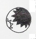
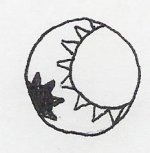
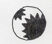
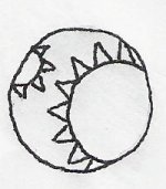
What do you think? Everyone else will see two suns when we know that they're actually tickly fingers, or feathers, or brushes, or whatever your little creative minds see there. Dominant color denotes designation. Sorry to make the lee look so small and subby but when they're equalized the whole thing starts looking like a baseball with teeth.....As for the scratchy scribblyness of my drawings I say YOU try to draw with a 3 year old looking over your arm saying, "Are you drawing suns, Mommy? Now draw me a horsey, and he needs a barn to live in, and hay for eating, and make some trees, and, and, and,". Anyway I'm sure one of you can clean these up on the computer. Oh, and the color doesn't have to be black.
 

Attachments

  • Ler.jpg
    Ler.jpg
    12.4 KB · Views: 31
  • Lee.jpg
    Lee.jpg
    10.3 KB · Views: 29
  • Switch.jpg
    Switch.jpg
    11.9 KB · Views: 31
  • Undecided.jpg
    Undecided.jpg
    10.5 KB · Views: 30
Very nice! I really like that it has a double meaning of sorts. Very cool. 😀
Oh and I know what you mean about kidlette's hanging on your arm. My almost 3 year old daughter has a habit of coming up to me when Im trying to type and saying "Lets hold hands!"
 
thease are all great ideas, but i think we need to deside on a single design or we will be stuck coming up with ideas and never agreeing on a unifying/identifying symbol.

i like Nessy's idea as well as Ogleme's.
what say one more person throughs in there idea and we choose from the three?
that way we can narrow it down and hopefuly find what we all can agree on.
 
I also like Ogleme's proposal -- very unobtrusive, and not position-dependent. It also looks less runic for those who don't like runic symbols.

Either one, Ness' or Ogleme's, would do nicely as far as I'm concerned 🙂
 
I love both and would purchase either or if we could get them made into something wearable!!! Let's do it!!!
 
Well, of course I liked MY symbol. 😀 😀 😀

So, what's next? Posting them to another thread and taking a poll?

[Nice kitten btw!]
 
awwww everyone needs a little pussy! (and if Missy Val takes that out of her siggy this post will look bad!)

About ogleme's design thgouh...I think I have the same thing to say that Kalamos said about mine...Maybe having too many different designations would be off putting to some people. I mean that maybe simplifying is a good idea.
Aaaalso I dont know a whole lot about the jewelry making process but adding colors may increase the cost quite a bit. Just a couple thoughts. Still love the design though, ogleme! God, I hate saying anything critical...Im always afraid it'll be taken the wrong way! So dont hate me please!
 
It's just nice to hear you all liked my design and I welcome any criticism. I colored it in and it's a lot more attractive but you know I would still probably vote for Ness's since it's just so simple and invisible to others not in the know...
We should find out about companies that create jewelry for organizations and such before deciding on the symbol or else we might go with something simple and find out later that we could've had more options, (I think someone mentioned Sears had a service in a prior thread).
Keep the ideas coming everyone!
 
What's New
12/25/25
Merry Christmas!

Door 44
Live Camgirls!
Live Camgirls
Streaming Videos
Pic of the Week
Pic of the Week
Congratulations to
*** brad1701 ***
The winner of our weekly Trivia, held every Sunday night at 11PM EST in our Chat Room
Top